
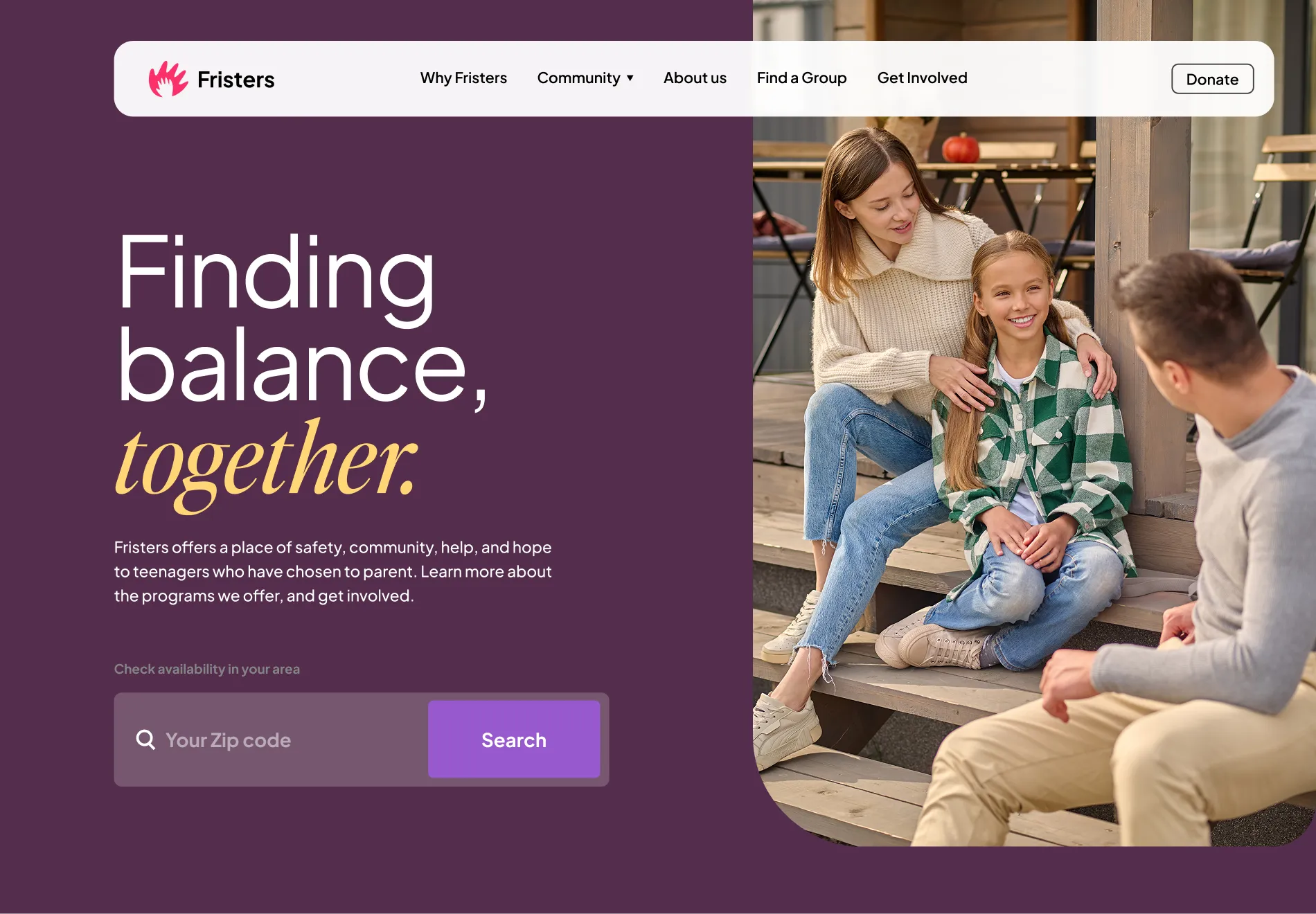
Fristers
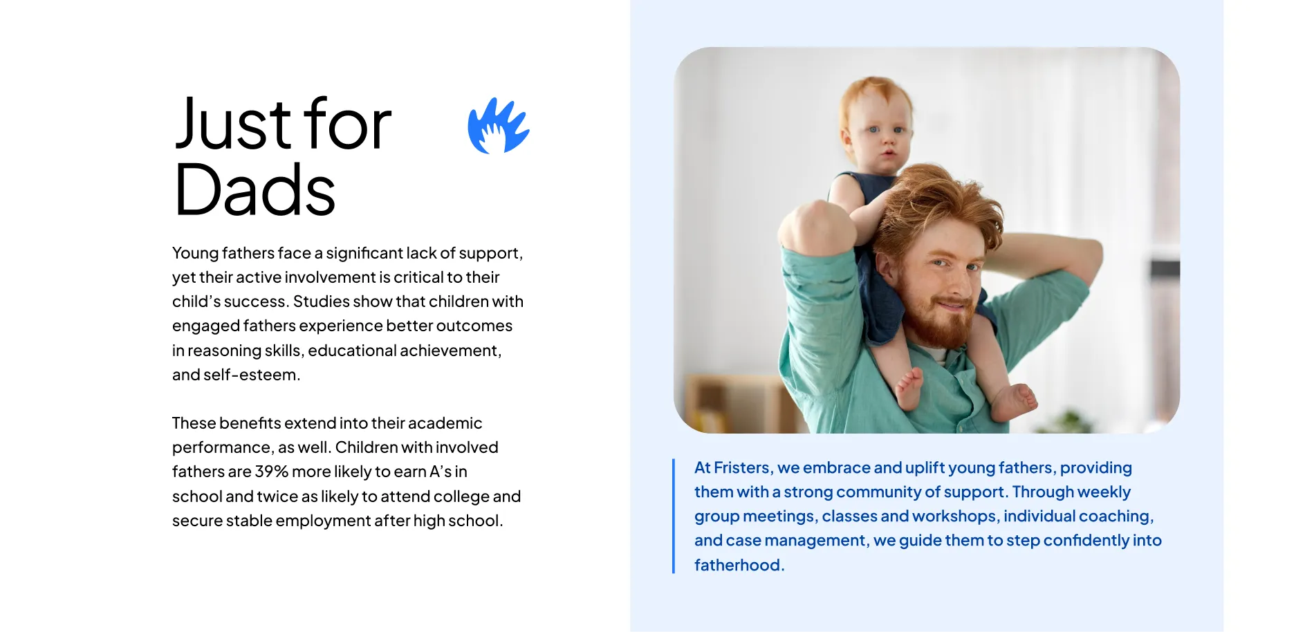
Fristers is a non-profit organization based in Irvine, California that focuses on supporting and empowering teen and young parents and their children.
I worked with Fristers on refreshing their brand's identity and logo.
Brand identity — Logo design — UI/UX design
SunUp Group
Logo redesign
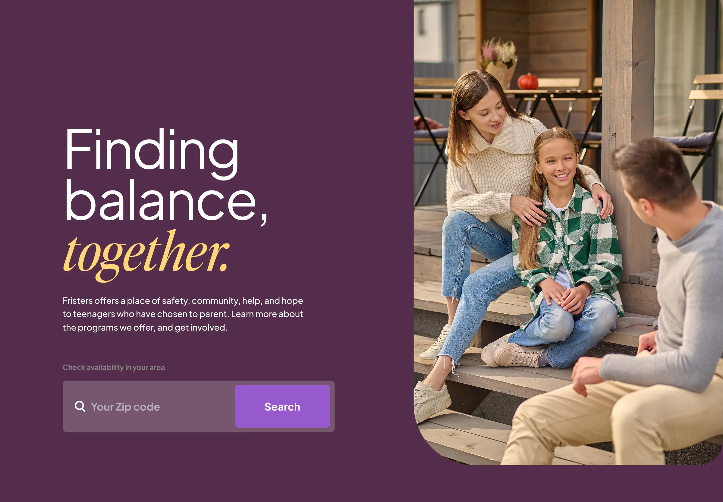
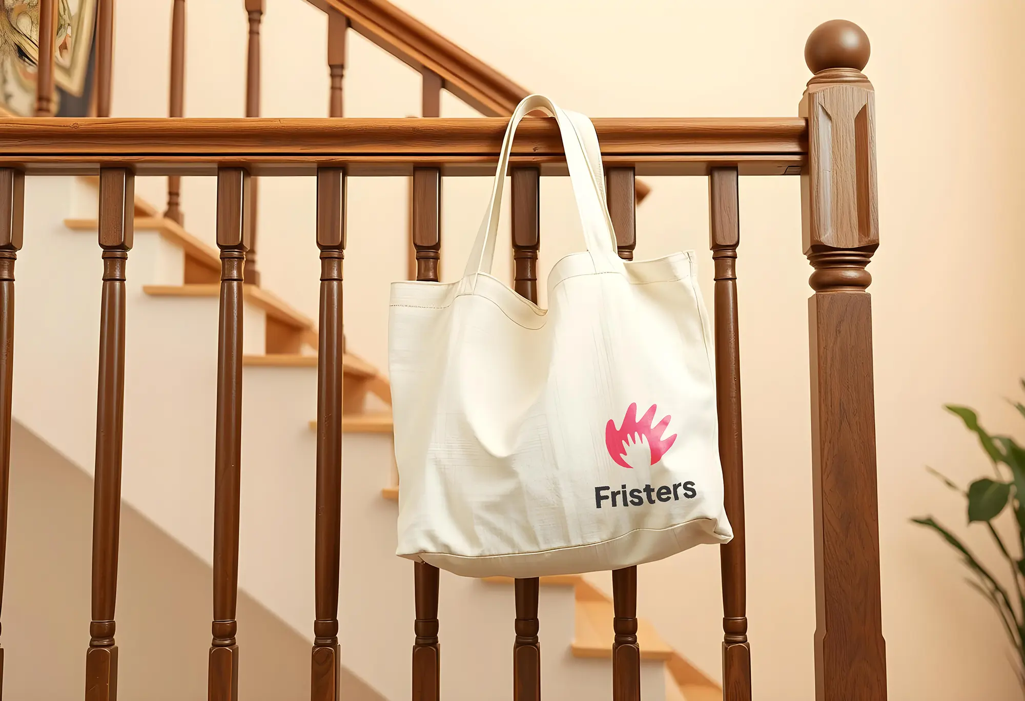
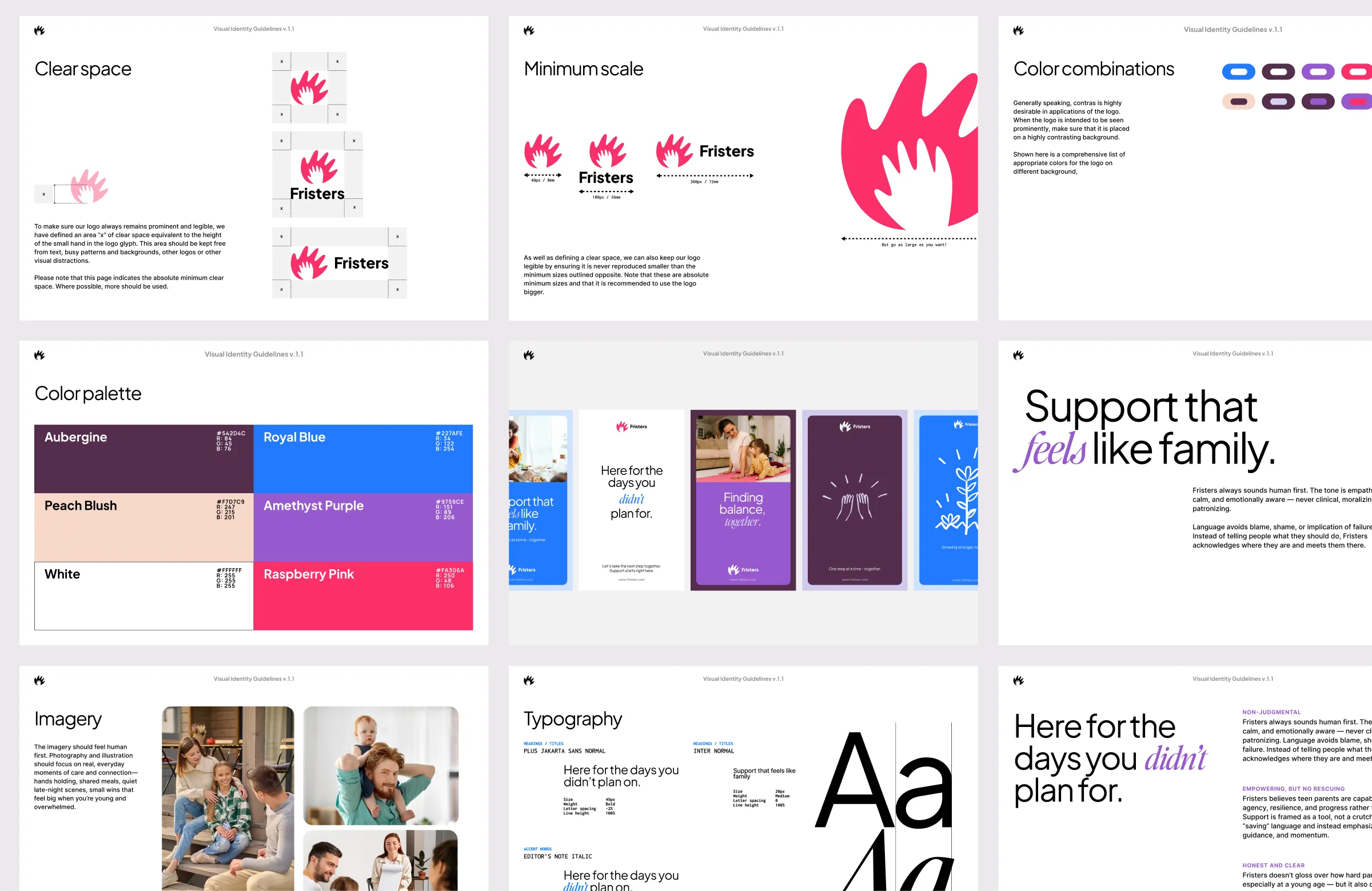
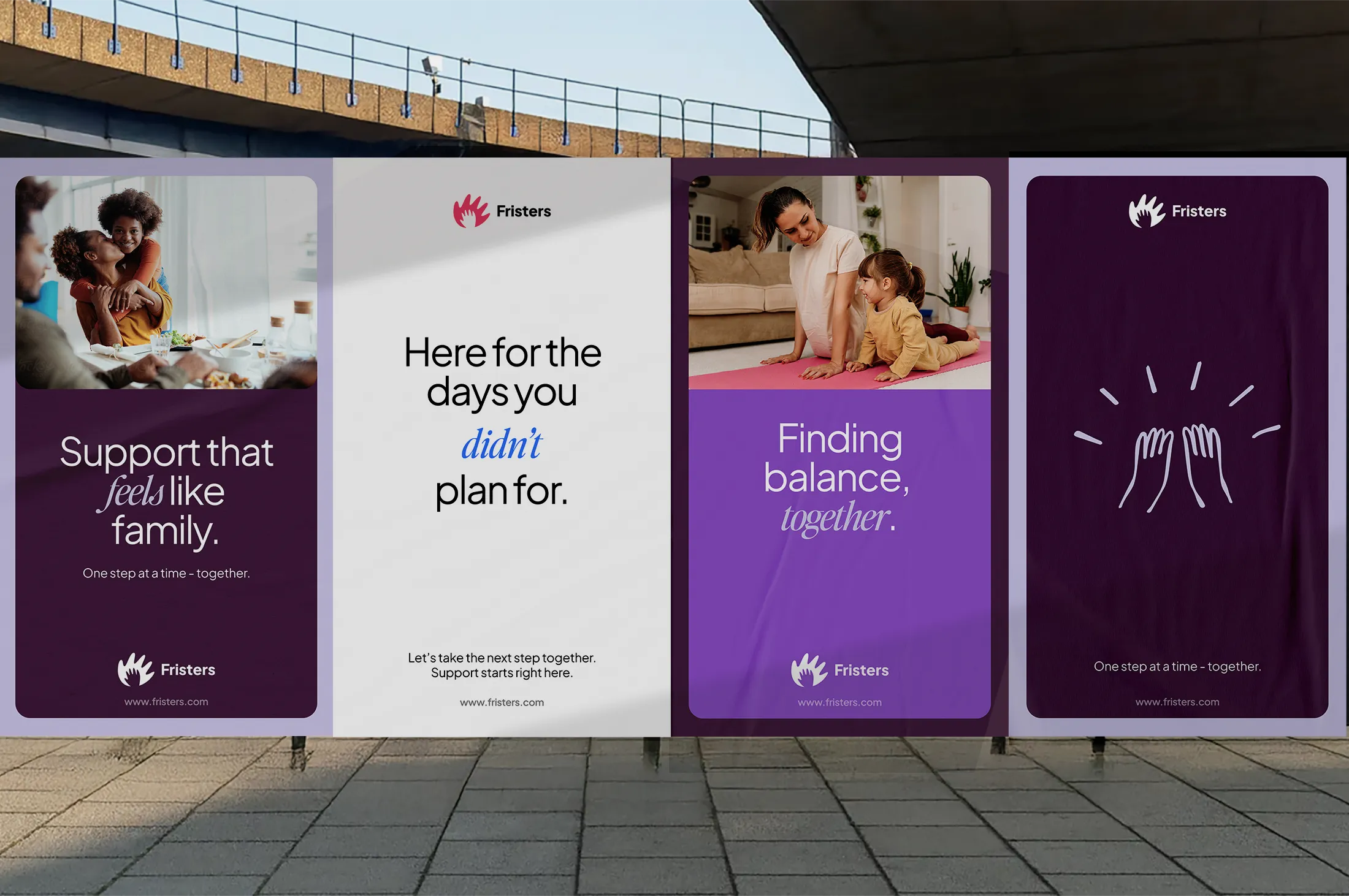
The logo was redesigned to better illustrate Frister's key focus on community. The mark features a hand with a smaller hand nested inside, symbolising guidance and connection. It reinforces Fristers as a trusted presence during life’s unplanned moments.
Brand refresh
In the early discovery phase of Fristers’ branding, it became clear that the colour palette would play a key role. Purple and blue were chosen to resonate with both mothers and fathers, while aubergine acts as a grounding, neutral tone. This balance helps the brand feel caring without leaning too heavily in any one direction.
Typography plays an equally important role: a considered pairing of two typefaces allows the brand to shift between clarity and expression, with a script typeface used selectively within taglines to accentuate key words.
More work
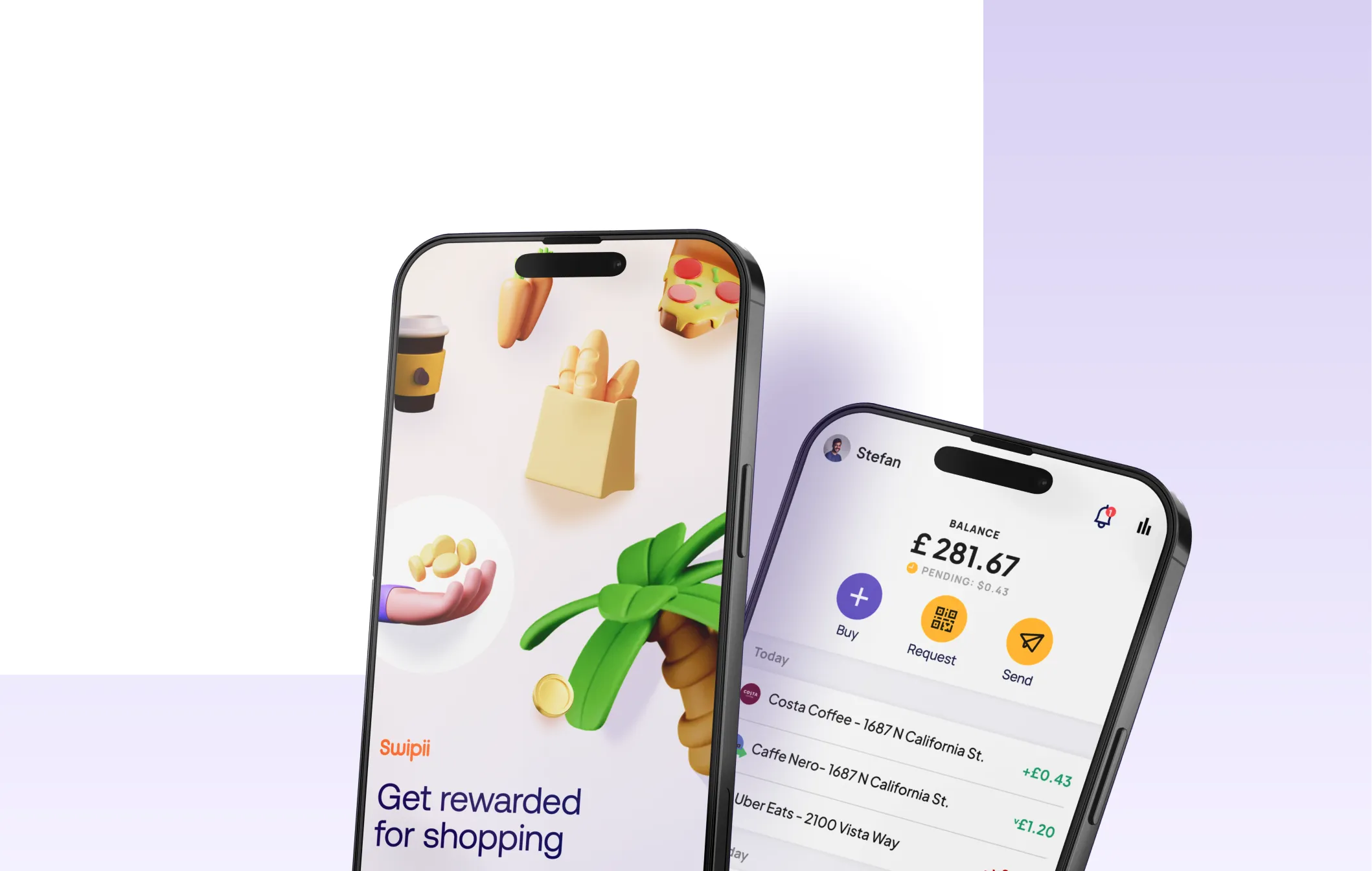
Swipii
Brand identity and UI/UX design for Swipii, a UK-based loyalty platform focused on rewarding everyday spending through a simple, intuitive user experience.

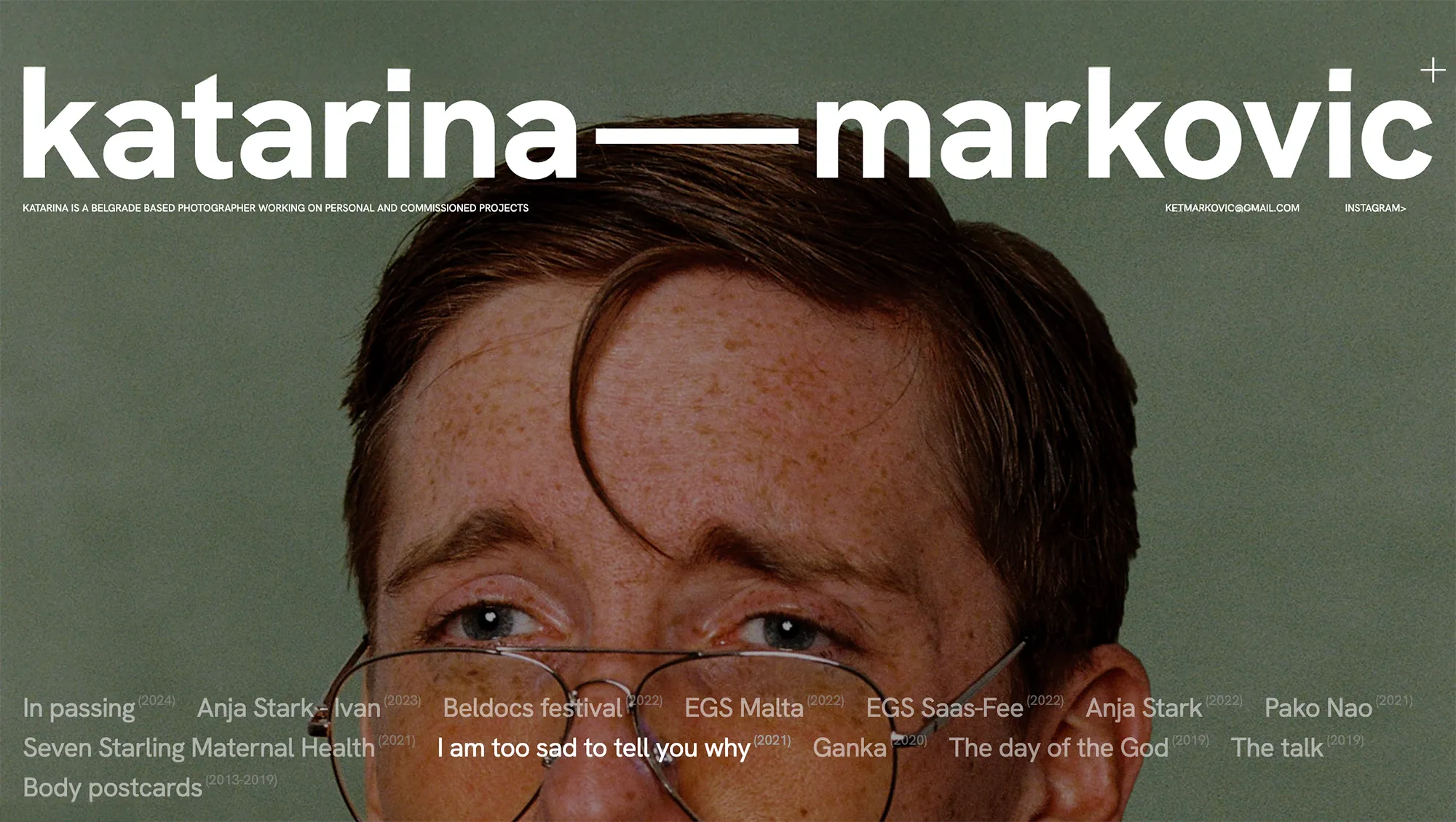
Ketmarkovic
A minimalist portfolio website designed and developed for Katarina, featuring a cinematic homepage and a seamless browsing experience between projects.